Manifest 2

I’m incredibly pleased to announce that Manifest 2 launches today. It’s a big update focused on goals and time management, and I think it’ll be very useful for freelancers and indie developers in particular.

TIME MANAGEMENT

A lot of freelancers and indie devs like me need to juggle time commitments between multiple projects. Manifest makes it easy to keep sight of the big picture by introducing goals. Simply set how much time you want to spend on each project per week or month, and Manifest breaks the time down into manageable daily goals. Using it during development, I’ve found goals to be incredibly helpful in managing my daily schedule and making sure all my clients get enough attention.

TODAY TAB

The Today tab tracks all your daily projects, their goals, and your progress. As you track time, Manifest shows your progress for each project and for your day overall. Once you’ve reached your goal for a project, it dims so you know to move on to other things. The Today tab also tallies the day’s total time tracked, your projected total time by the end of the day, and whether you’re on pace to reach your daily goals.

SMART GOALS (Pro)

Pro users can take advantage of Smart Goals, which make the Today tab even more powerful. Smart Goals automatically adjust when you’re ahead or behind schedule, so you’ll know if you have extra time to devote to other projects.

For example, suppose my goal is to spend 20 hours per week working on a project for Acme Corp, which would normally break down into a goal of 4 hours per day. By Thursday evening, I’ve already tracked 18 hours of time. With Smart Goals, Manifest automatically adjusts my Friday goal to 2 hours. Now I know I have time for other things (or happy hour!)

CHARTS AND TIMESHEET

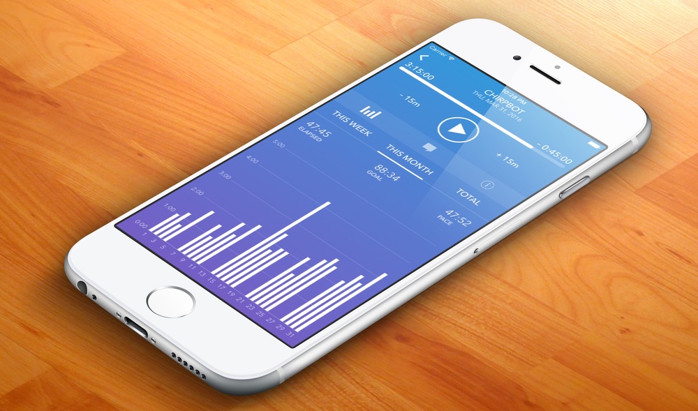
Sometimes it’s easier to grasp information visually, so Manifest includes charts tracking your logged time across the current week or month. They’re a great way to see patterns in your data. There’s also a total time chart that shows a month-by-month indicator of your total time, as well as a projection for the current month.

On the other hand, there’s no more familiar way to look at time than that old stand-by, the calendar. Manifest has you covered with the Timesheet. Each day on the calendar shows your total tracked time, and below the calendar is a detailed list of your projects as well as any notes you entered. You can also export your data into CSV format from the Timesheet view.

PROJECT ARCHIVING (Pro)

Manifest can archive your inactive projects to keep things tidy. Archived projects don’t show up on the Today tab, but any time you’ve recorded will still be displayed on your timesheet.

PRICING

Manifest 2 uses a new subscription-based pricing model. For $3.99/month or $29.99/year, you get access to all the Pro features, including Smart Goals, archiving, unlimited projects, and customized data export options.

I wanted to talk a little bit about why I chose to move to a subscription pricing model. There are essentially two reasons. First, subscriptions create sustainable revenue that allow me to spend more time working on Manifest. I love working on Manifest, but I also have to pay the bills around here. Relying on a constant stream of new users probably isn’t going to cut it, and means I always have to be concentrating on growth. I’d much rather focus my energy on improving Manifest for a smaller pool of returning users who love the app.

Second, subscriptions make it easier to try out the Pro features to see if they fit your needs. Try a monthly subscription, and if you discover that Pro isn’t your thing, you can always cancel. On the other hand, if you enjoy Manifest Pro as much as I do, the annual subscription is a great deal for the whole year.

I’ve been working on this Manifest update for several months, and I’m really proud of it. I hope you enjoy it as much as I do! Manifest 2 is available now on the App Store. Suggestions and constructive criticism are always welcome – find me on Twitter or email at feedback at tapandtonic dot net. Thanks and enjoy!
Seeking Beta Testers

I’m wrapping up development on a major update to Manifest, my time tracking app for iOS. In order to make sure that the app is stable and easy to understand, I’m looking for beta testers to help put Manifest through it’s paces.

The update is focused on setting and reaching goals as you track your time. Manifest is a great app for freelancers and independent developers who need to track time across a number of projects.

If you’re interested in joining the beta, please sign up!

Sign up for Manifest Beta

How Apple Can Improve the Apple Watch Without New Hardware

I wrote recently that I’ve been somewhat disappointed in the first generation Apple Watch. A lot of that has to do with the limitations of the hardware, but a sizable part is related to the software as well. Apple can only release new hardware so often, but they can update the OS much more frequently. Here are a few areas where I think there’s room for significant improvement without new hardware.

Context Awareness

Right now, the Apple Watch does pretty much the same things regardless of the time, your location, the weather, etc. For a “smartwatch,” the Apple Watch isn’t all that smart. But the Watch has access to a trove of data about you and your habits via your iPhone, and it could take advantage of that data to act smarter. Imagine if the Watch could switch faces based on whether it’s a weekday or weekend, or show different complications based on whether there’s bad weather in the forecast. WatchOS could automatically re-order your Glances to load the most relevant ones first – for example, showing the MLB Glance first if your favorite team is in a tie game in the bottom of the 9th.

Complications could also improve a lot by including some contextual information. For example, the Timer complication is great when I have a timer running. When I don’t, it just sits there displaying “SET” and taking up space. Users could assign priorities to complications, so that another could appear when one has nothing to show. If no timer is running, the weather could appear in its place. Even better, the OS could make some smart decisions about which complications to show. If I’m traveling, I might be more interested to know the current time back home than in the current moon phase. Likewise, if it’s Friday afternoon and my schedule is clear for the weekend, I might be more interested to see what tomorrow’s weather will be like. Giving developers access to context information could help apps provide context and priority clues to the OS.

Re-Think the App Launcher

Let’s face it: The app launcher on the Apple Watch is a mess. The tap targets are too small, even on the 42mm model, and organization is difficult at best. It’s a far cry from iOS, where a simple grid of icons has served users well for years. The honeycomb-style app launcher on watchOS feels like Apple prioritized how it looks over how it works. It’s possible that the real answer here is to re-think the app model itself on the Watch. But that’s a huge change, and there are a few improvements Apple could make without fundamentally re-thinking whether apps make sense on the Watch.

If anything, a tiny display like a watch is most suited to something like a simple grid. The Watch would be a great place to use the same predictive technology that iOS uses to suggest apps on the search screen. Imagine that clicking the crown presented you with a grid of apps based on a number of contextual clues, like your current location or how recently you launched the app. I’m guessing the most Watch owners only use a handful of apps at most, so chances are good that the first screen would contain the app you’re looking for. (This is the app you’re looking for.) If you’re looking for something more, you could swipe through additional pages of apps ordered however you like, much like iOS.

Make Better Use of Hardware Buttons

How often do you really want to send a drawing or heartbeat to someone using your watch? If you’re like me, almost never. On a device that has only two physical buttons, it certainly seems like a waste to devote one of them to a communication panel that almost always goes unused. At the very least, I’d like to see Apple let users assign that button to another function. Alternatively, it could bring up another menu (perhaps Glances?) that might be used more frequently. The same goes, at least in part, for the crown itself. Fixing the app launcher would help make it feel like clicking the crown at least opens something useful.

More Watch Faces

Watch faces are one of the most fun aspects of the Apple Watch. The face is the part of the watch I see the most, and a new face can make it feel Iike a new device. I have a few faces that I use often, ranging from a Modular face with lots of data to a minimal utility face that feels more stylish.

Unfortunately, there aren’t as many faces as I’d like. Apple added a few new ones when watchOS 2.0 came out, but most weren’t faces that I’d use regularly. So far, watch faces haven’t been opened up to third party developers, and I think I understand why Apple is proceeding cautiously on that front. But if Apple is going to keep watch face development to themselves, I wish they’d help us out and release a few new ones! They’ve refreshed the lineup of Apple Watch bands every six months or so, and it’d be great if faces were on a similar schedule. There are so many styles, colors, fonts, and configurations to work with that it’s hard to believe they’re out of ideas.

Ultimately, a lot of the limitations of the first Apple Watch relate to the hardware. The CPU is too slow and/or the battery too small for the watch to be as snappy and responsive as I’d like. At the same time, a few software updates can go a long way. I hope Apple has enough of an open mind about the Apple Watch as a platform to re-think some things about how it works. Even with the same limited hardware, it could be a much more useful device with a few relatively small changes.